They call me
"The Rubber Duck".
"The Rubber Duck".
RETRORATING: 16
RETRORATING: 16

Forum » Suggestion Box » Article Text Box Expanded
|
|

|
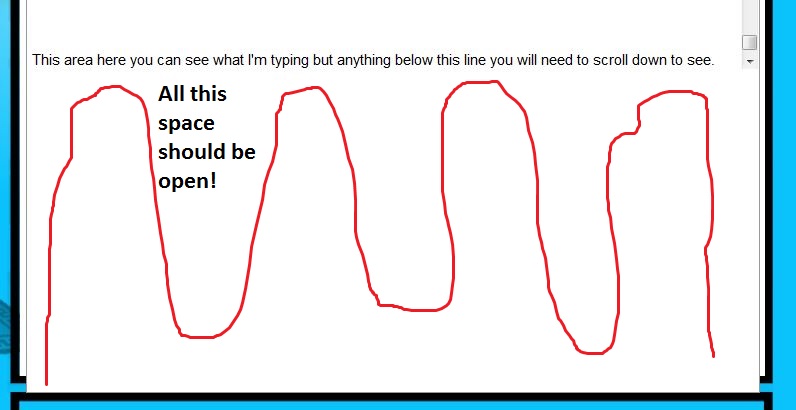
I noticed when working on a piece in the edit field there is a large white area that looks no different from your field but you have to scroll because your text goes behind it. It's open space, so why not make it viewable area so we can see more of what we're working on? See the image below for clarification.  Quote |

|
I agree. I tried a bunch of things to make the space bigger for me. Shrinking by browser window and other stuff like that.
|

|
Yes, I see what you mean. I'll see if Moudy can do something with that.
You love this signature.
|

|
See if the issue is fixed now. I can't really check it at the moment cause I'm on my phone.
You love this signature.
|

|
Looks the same on my end, the scroll box is still down halfway.
|

|
I think you just need to logout then login again !
|

|
Nope, still the same. Can anyone else verify? See in this image, anything below the end of the scroll bar is covering the edit field. I also cleared my cache.
 |

|
When I did my articles both were that way I just assumed it was the way RetroDaze was. It was hard to see anything at all and I had to use the preview button repeatedly to read what I had written. Only 1/3 of the screen is visible at a time and if you have a picture already inserted you cannot see what you are typing.
|

|
In the editing field, looks good in WYSIWYG mode.
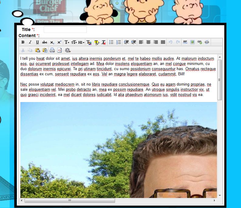 However, in code mode, 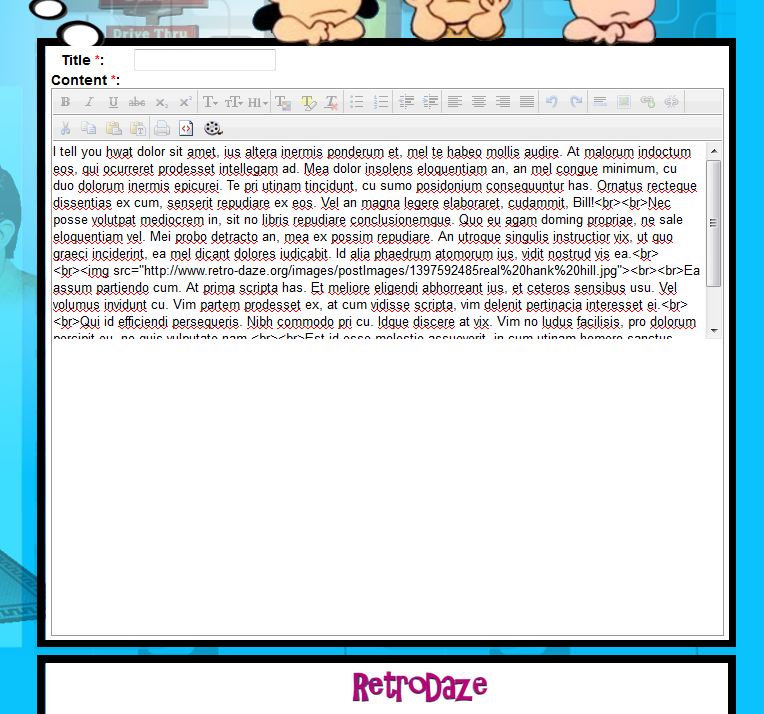 |

|
Hmmm. Is it perhaps a difference in browser that makes shakins and vkimo appear differently?
You love this signature.
|

|
What's wysiwyg mode?
|


