Holidays,
People!
RETRORATING: 14
RETRORATING: 19
- HOME
- YOUTUBE
- ARTICLES
- VIDEOS
- THEATER
- CLASSIFIEDS
- VHS COVERS
- CEREAL BOXES
- GAME BOX ART
- READ ALONGS
- PODCASTS
- FORUM
- FAQ
- POINTS STORE
Don't mess
with the bull.
JOIN!!!
What's Old is New Again:Retro Branding Comebacks
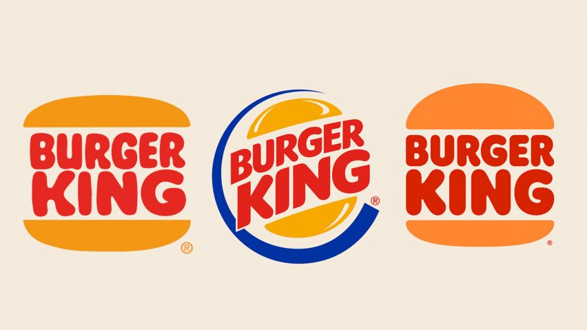
As time moves forward logos and branding changes. Mascots come and go, items leave beloved fast food joints and restaurants, and stores will change appearances to fit the new brand. What some may remember as a kid may not recognize what a store or restaurant is anymore as time passes. However there has been a growing trend among retailers and fast food joints. That trend is going back to old logos and branding.
For fast food it's cleaning up the old logo and bringing it back. The most notable being Pizza Hut and Burger King. For Dominos, it was their character The Noid. For retailers like Walmart and Hot Topic it is having collections, usually shirts, of old logos and slogans for sale.

Though reviving retro logos and designs are nothing new for a limited time, usually in the summer. This trend of retro revival for the long term however is something new. Though two questions remain, why is this happening and what's next?
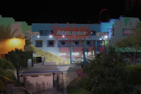
The why is straight forward, nostalgia sells. This especially rings through over the past decade as companies, mostly General Mills and others released retro packaging during the summer. Then others got in on it as the before mentioned Pizza Hut went back to its old branding and then others followed after them. Most recently Universal Studios Orlando has made a store dedicated to the park's history, though Disney has been doing this for a few years now.
So, what's next for this trend? It's hard to say for certain. There is no doubt more companies will continue the trend, but to what extent has yet to be seen. McDonald's has made references to past mascots, however they cannot really be used in advertising nor is it in their current goals by the looks of it. Same can be said for other fast food joints like Taco Bell. Companies already doing it will likely expand on it and capitalize on it as much as they can.

However in the end this trend will likely stay as the early 2000s reach twenty years and the nineties hit thirty years ago. For good or for bad, it is nice to see the old become new again here and there. So let's make the most of it while we can.


onipar Posted on Mar 24, 2022 at 02:29 PM
As a society, we always seem to be looking backward as much as we look forward. I can't complain. It's important to remember what has come before. I'm with Vapor on this one: I love when these things spill into the physical. I still have my retro BK cup from the Stranger Things release a couple summers back. And the rerelease of New Coke. That's all fun stuff.
Mr Magic Posted on Feb 08, 2022 at 06:34 PM
WWE used their classic logo a number of times. Mostly when they were doing old-school-themed shows.
https://www.dafont.com/forum/attach/orig/4/5/458999.jpg
Vaporman87 Posted on Feb 08, 2022 at 05:39 PM
Agreed. Though I think it is one thing to use old branding in advertisements and such. It is something else entirely to incorporate those old aesthetics into the business model and see it extend to physical items and locations. THAT is what I'm waiting for.
Bein' bad in the neighborhood I was a pretty good kid. Too good for my own...
Remember this was before the Disney Princess marketing which came about in the late 90s early 2000s. This does not include any fandom revivals from ...
I still have many Top 10 lists just waiting to be published and here is another that I was reminded of during my recently published interview with ...
amzn_assoc_placement = "adunit0"; amzn_assoc_tracking_id = "vaporman87-20"; amzn_assoc_ad_mode = "search"; amzn_assoc_ad_type = "smart"; amzn_as...
If there's one image that is forever associated with the 80s, it is the hard rock/glam metal star. Men with spiky costumes, massive colored hair...


