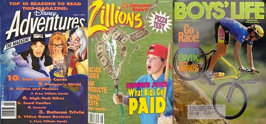
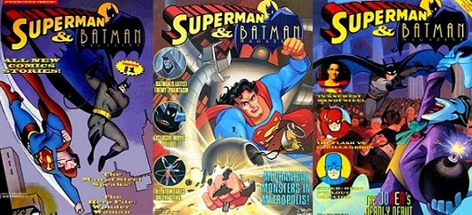
There were a lot of interesting kids magazines available on newsstands in the early 90’s. You had your Disney Adventures, Zillions and for the scouting squares among us, Boy’s Life. We saw our parents reading People, Newsweek and Popular Mechanics, but we wanted some news in print that we cared about. For me in 1993 it was all about comic books, so it was only natural that I drifted towards the latest news found in the pages of Superman & Batman Magazine. I’m not sure how many of you out there got a chance to flip through this 20 page promotional piece for DC comics 2 biggest stars back in the day, so let’s take a quick tour of the pages from my personal collection.

Riding on the popularity of Batman: The Animated Series, this bi-annual magazine hit stands with heroic cover images reflecting the dark, angular design style of the popular cartoon show. What you may not realize is that at the time only Batman had been animated in this style that would soon become the signature look of the DCU. It was years before Superman: The Animated Series and various iterations of Justice League appeared on TV sets nationwide, so seeing popular DC characters inhabiting the same universe designed by Bruce Timm, really was something to get excited about. It got my attention, at least! I bought the first 2 issues at Barnes & Noble, then signed up for a subscription.

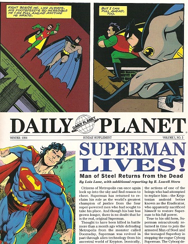
Each issue contained solo comic book adventures of the titular heroes, padded with mazes, word games, articles on actual bats…you know the stuff publishers assume kids like to spend their time on, not realizing that video games are waiting in the next room. But the section I really enjoyed was called The Daily Planet. These articles would be written as if the newspaper of Metropolis really existed, bringing you into the world of comic books through “serious journalism”. The magazine launched during the time that Superman died and came back from the dead, so the headline of “Superman Lives!” with the Man of Steel being quoted about his sadness at not being unable to stop the destruction of Green Lantern’s hometown of Coast City was really cool.

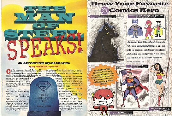
What’s interesting is that this revelation had been preceded in issue #1 by an article titled “The Man of Steel SPEAKS” which was touted as an interview with Superman from “beyond the grave”. You know you’re in for some fun when the interviewer opens by asking how The Last Son of Krypton is feeling to which the ghost of Superman politely responds, “As well as can be expected, thank you-considering that I’m dead.” You could tell the editors of the magazine were having fun with this assignment, realizing that most kids were just in it for the pictures. They also had a fan art section where kids could submit their own drawings to be published. This was pretty common in most cartoon/comic focused magazines of the day and always made me feel self-conscious about my own artistic skills.

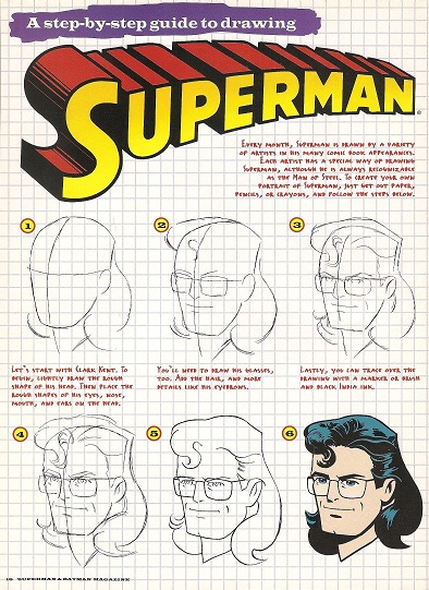
Speaking of drawing, they also occasionally had tutorials on how to draw like the pros. In the example above they wanted kids to get excited about drawing a picture of their Lesbian Aunt, oh wait, that’s just Clark Kent sporting his embarrassing super-mullet! Apparently Superman’s life force resurrected, but his sense of fashion did not. I can’t understand the logic of this choice. Yes the hair was an editorial mandate to stay consistent with what was happening in the comics, but at least make it actually Superman and not his bespectacled brunette Fabio imitating alter-ego. No kids were clamoring for a long-haired Clark Kent action figure, I assure you.

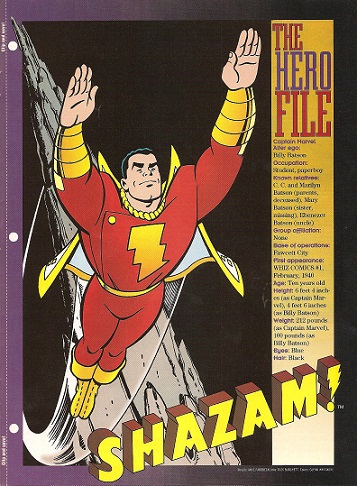
One other feature I’ll mention was the inclusion of The Hero File tear-out pages. Kind of like a giant trading card, these were meant to be put in a binder and referred to when you needed to impress your friends with comic book knowledge. “Did you know that Captain Marvel’s first appearance was in 1940 in issue #1 of Whiz Comics?” you would ask your friend. “No and when are we going downstairs to get a Squeeze-It? That’s the only reason I came over to your house in the first place, Nerd Boy.” Again, the real draw was the previously unseen art style that made you think they might guest-star on the next episode of Batman: TOS. Sadly this never happened. Batman preferred to fight crime on his own apparently, but Superman: The Animated Series made guest stars like Lobo, The Flash and more a regular feature on the show.

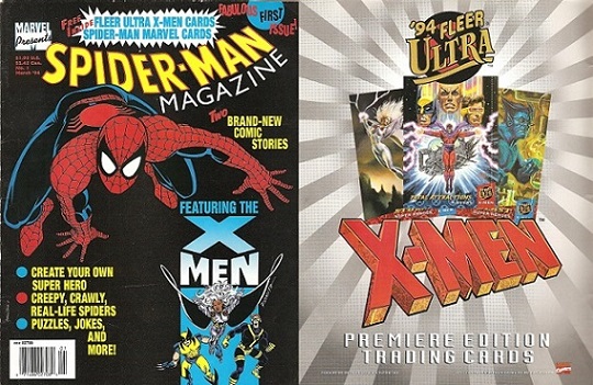
I should mention that Marvel tried to get in on the kids periodicals act as well with Spider-Man Magazine, but as much as I prefer Marvel to DC, I bought one issue and decided I’d stick to the comics. Spider-Man Magazine just didn’t have the same flair. It did have Fleer though, as in ads for X-Men trading cards that resembled the epic painted artwork of the Marvel Masterpiece series. OK, end of article, thanks for reading…JUST KIDDING, this thing is just getting started! The real reason I wanted to share Superman & Batman Magazine with you was for those great 90’s ads that grace the spaces in between the featured articles. Check out this retro goodness!

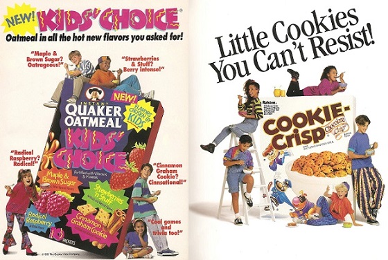
First up are these ads for Quaker oatmeal and Cookie Crisp cereal. Just look at the wardrobe for these kids: Hammer Pants, Backwards Baseball Caps and Sideways Pony Tails? We have hit critical mass on the 90’s here folks, especially with quotes like, “Radical Rasberry? Radical!” But what I really find fascinating is the fact that the layout of these ads are almost identical. Let’s break it down: A giant box of the product, surrounded by multi-racial kids dressed in the fad clothing of the day, all striking poses with attitude. The only thing Quaker did different was tilt the box, which makes their sugary breakfast treat seem even more EXTREME!

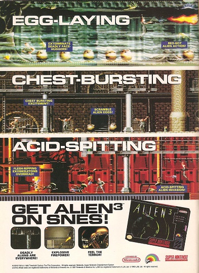
This is an example of the last gasp of R-Rated movie properties being marketed to children and it’s ridiculous. Alien 3 wasn’t that thrilling for adults, let alone appropriate for kids. Look, if this was being marketed in Gamepro or EGM I wouldn’t have a problem, mostly teenagers were reading that stuff anyway. But why are we talking about “Chest Bursting Excitement” and “Flesh-Ripping Exoskeletons” in a wholesome magazine read by the 8-10 year old crowd? The other example just prior to this was Terminator 2: Judgement Day, which despite the violence actually had a heartwarming story. Alien 3 on the other hand was about Ripley ending up on penal colony and shaving her head so she didn’t get assaulted by the inmates…Yikes. Definitely a relic of days gone by.

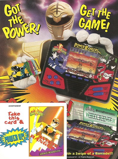
Here’s the first of a double shot of Power Rangers ad-venture. Now this is a video game that makes sense for the pages of this publication, the Power Rangers Tiger Barcodz handheld LCD game. The basic premise behind this device was that you would swipe cards to fight a different bad guy or play as a different Ranger. Although, since the Power Rangers were mostly distinguishable by color, it’s seems a moot point for the outlined characters on the LCD screen. You’ll notice that the ad even contains a free card, to ignite the ‘gotta have ‘em all spirit inside the mind of a child. Most entertaining is the fact that Tommy, The White Ranger is telling us to “Got the Power!” “Get the game!”, which is either an ironic use of “Engrish” in a nod to the original Japanese source material or a typo by the copy department. I’m leaning towards the latter. It really should read “GOT the power? Get the game!” or GET the power! Get the game!” Although if I was writing the ad it would read “For the love of all that’s holy, don’t play Alien 3 you sweet, innocent child!”

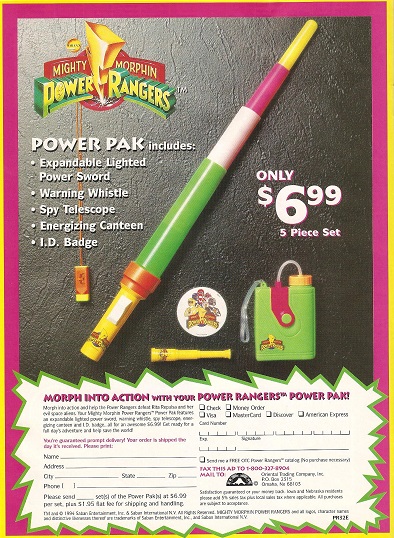
This next one is a great example of just slapping the name of popular kids show on generic merchandise and waiting for the money to roll in. What makes this special is not it’s affiliation with the Power Rangers franchise (“Energizing Canteen”? Come on now), but the fact that each of us owned at least one of these items in some form during our youth. Not owning a plastic expanding sword was like not having a Koosh ball in your toy box and the Spy Telescope was a regular prize to be gained for 200 tickets at Chuck E. Cheese’s. For $6.99 plus shipping and handling this actually was a better deal, just think of how much skee-ball you would have to play to earn even 100 tickets. Really though, the color scheme says it all. Neon green and pink were the lens through which kids of the 90’s saw the world. We couldn’t even register Earth tones during that decade, “If it ‘aint bright, it ‘aint right!”

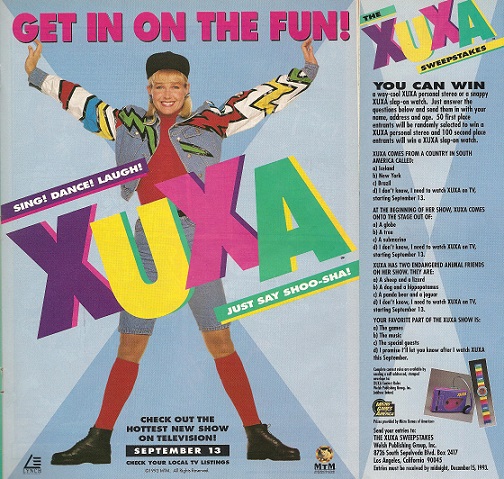
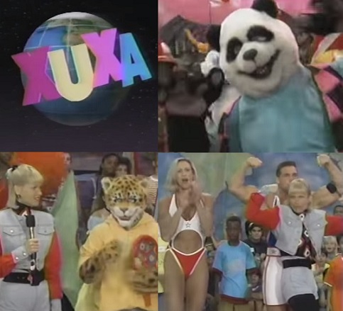
Personally I think I’ve saved the best for last here, it’s XUXA! “Just say Shoo-Sha”. If you don’t remember the Brazilian import kids show host, I don’t blame you, as her American television program was very short lived. Although I only caught an episode or two being aired very early morning before school, I can’t say it didn’t make an impression. Mainly because of the freakish human/animal hybrid people she surrounded herself with while singing sugary sweet tunes to the young ones.

AHHHH! Something is just wrong with that picture, wouldn’t you say? I can’t help but wonder what kids entered to win the Xuxa “personal stereo” or Slap-On Wrist Watch and if they were happy with their purchase. I have a feeling they were giving those things away after the first week’s ratings came in. Even guests like the
American Gladiators couldn’t save this sinking ship. You can watch the madness for yourself at
this link.
Xuxa holds extra personal interest to me because I lived in Brazil for a few years and she is the
Oprah Winfrey of that country, man. Anything she endorses turns to gold and she seems to appeal to all ages with her perky smile and wild fashion sense.

I remember when I first arrived in São Paulo and seeing poster sized ads for food, beauty products or Breast Cancer Awareness on store windows and doing a double take, “Hey, it’s that demented kid’s show host from when I was 11…why is she fondling herself?” It blew me away that this vague pop culture recollection from my youth was actually a national icon across the equator. Hey, one man’s GoBots is another man’s Transformers, y’know?
I hope you enjoyed this look at a strange time in publishing for the youth of America. So tell me, what magazines did you read as a kid?

